
B2B SaaS website redesign
A clearer story for a cloud cost platform
A two-month redesign of a three-year-old SaaS website, rebuilt around a clear value proposition and the trust signals B2B buyers look for.
- Role
- UX research, UX and web design, developer handoff
- Team
- Design intern, copywriter, developer
- Timeline
- 2 months
- Platforms
- Web, Android, iOS
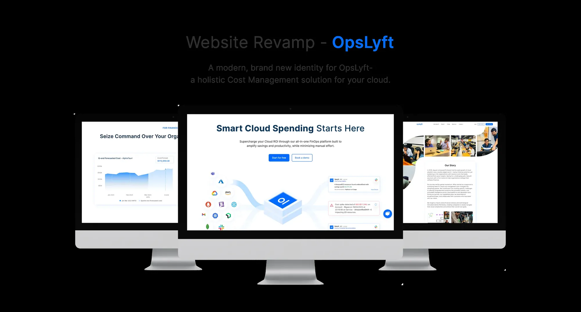
Overview
OpsLyft's website no longer matched a fast-changing B2B SaaS market. The goal was a fresh, credible presence that explained the product quickly.
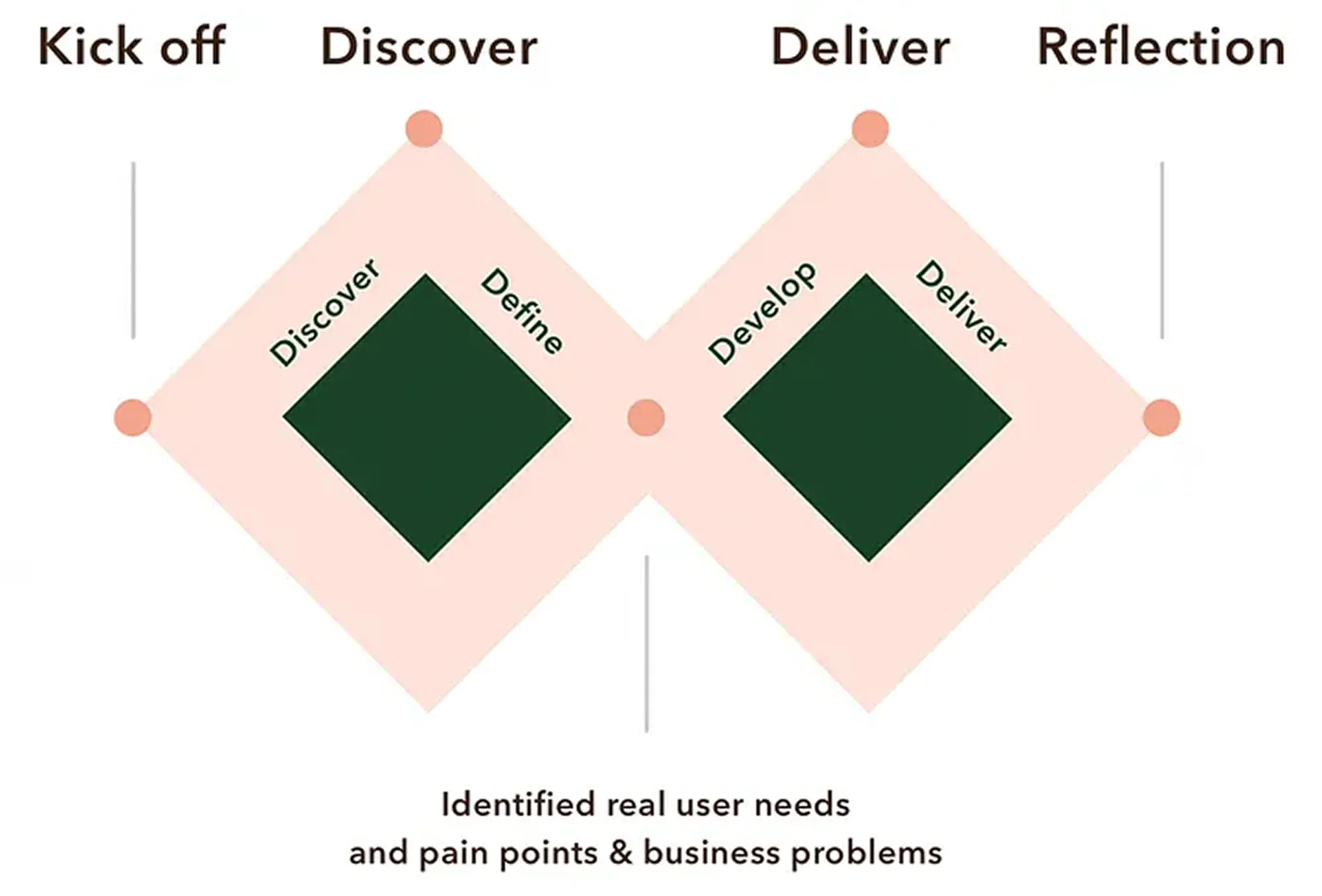
Gathering data
Stakeholder interviews, an analytics review and competitor analysis revealed an unclear value proposition, dated visuals and confusing navigation.
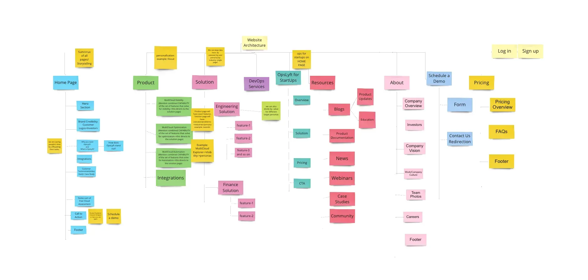
Defining the problem
- Clarify the value proposition and key benefits
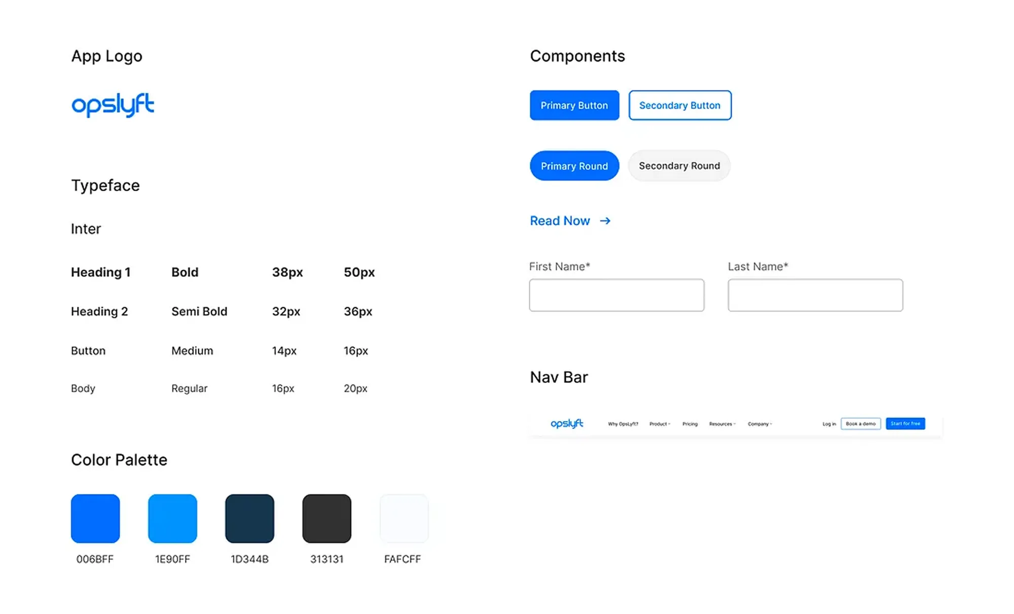
- Modernize the visual design and brand
- Simplify navigation and improve discoverability
- Increase trust and credibility with B2B buyers
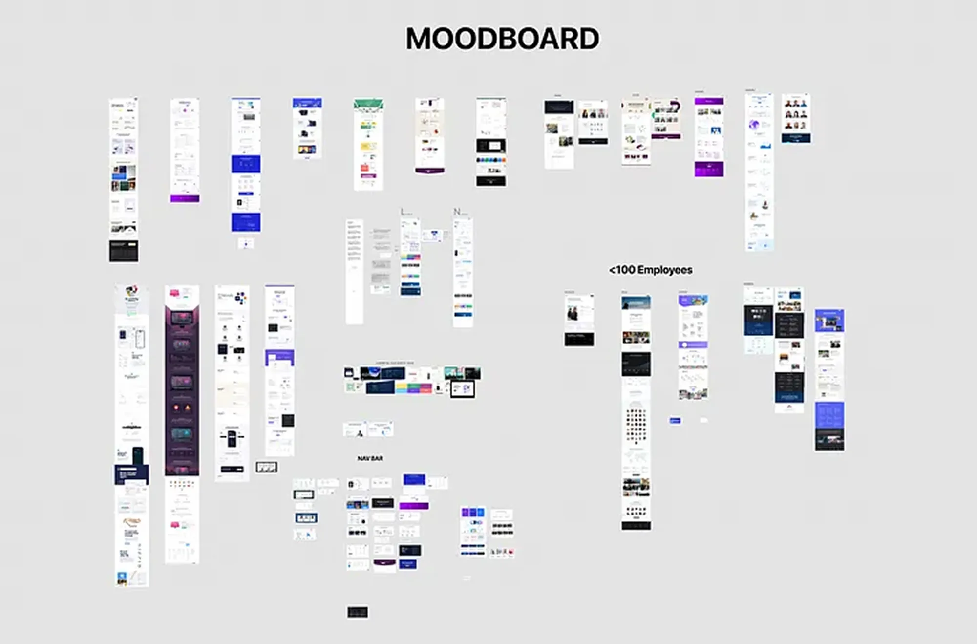
Ideating and prototyping
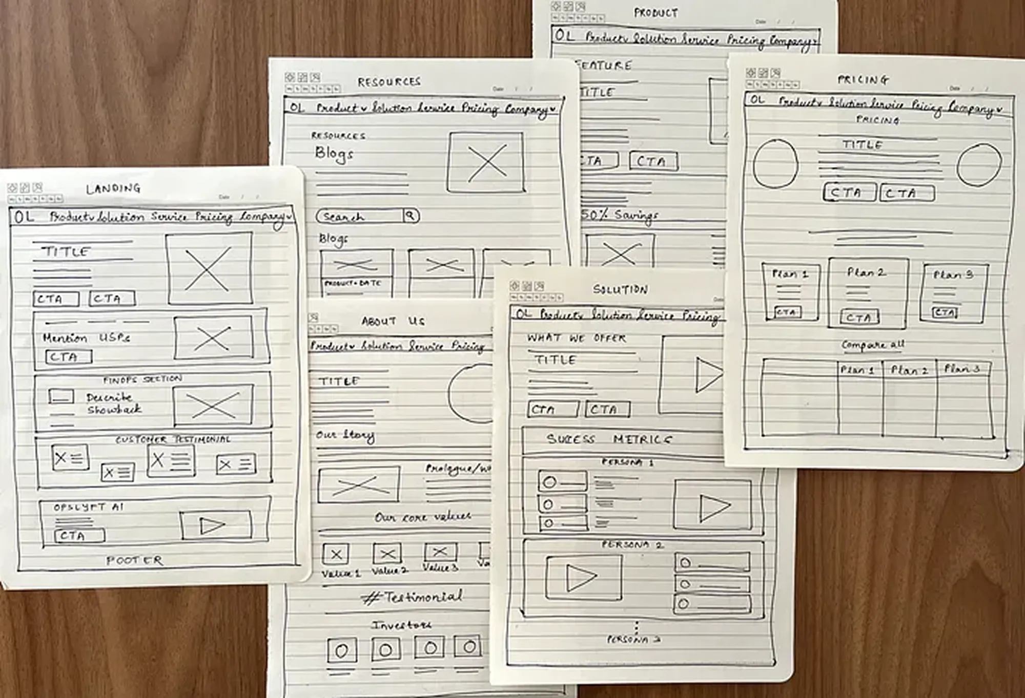
I explored multiple homepage and landing page layouts, tested navigation prototypes and iterated on messaging. User feedback shaped a clean, conversion-focused design.
What I learned
- Consistency builds trust: a unified brand language increased confidence and engagement.
- Clarity drives action: clear calls to action and messaging improved conversion and reduced bounce.
- Iterate with real users: frequent testing kept the redesign aligned with user and business needs.